Peachy Patients
Brand Design →
Challenge
Made for patients, by patients, Peachy is meant to be a trustworthy ally for every person that is dealing with medical bills. By giving them access to your medical records, they can help you to break down every item that has been charged to your account, and to solve any question or problem that might appear along this process. Peachy equips patients and their medical providers to regain control of the patient's entire health experience.
Goal
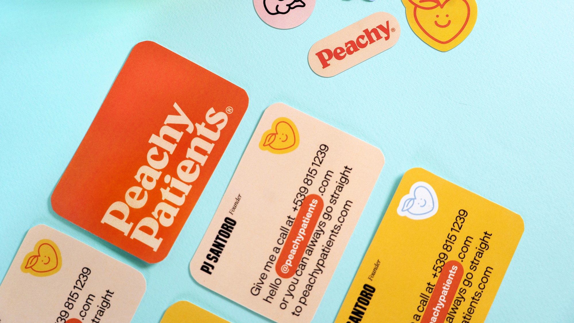
Peachy wanted to present itself as something opposed to what people think when it comes to medicine and medical bills: a cold, formal, and sometimes severe world. So the main goal was to present this brand as someone warm, close, and easy to understand, and to go along with. Another challenge was the use of the peach icon, which, for some people might have a sexual connotation, but to leave it out of the brand would have been ironic, since it is included in the name.
Solution
We’ve created an inclusive, fun, and honest graphic identity by using warm colors and pop elements. For the peach icon, we turned it into a heart that represents the medical world, but also gives a message of empathy, closeness, and care, while at the same time mixing it with a peach by adding a leaf at the top. We managed to design a friendly brand for all users, making sure that Peachy doesn't turn into a reminder of the complicated medical issues and bills, but into a friend that understands you, someone you can lean on.


